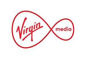
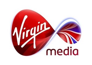
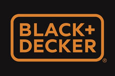
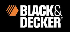
Two well known brands, Virgin Media and Black+Decker, have recently simplified their logos.
Why should your logo design be more simple?
Think about whether simplifying your company logo design can improve the way you communicate your brand to your target market. The key advantages are as follows:
- It will make your brand more easily recognisable, particularly at smaller sizes
- It will give more scope for implementation across a wider range of applications
- Reproduction will be more consistent across different media
- Can be an opportunity to make your brand stand-out from your competitors
- It can also give more scope for creativity with brand endorsement (look at the coloured spectacles)
- It gives the underlying message of a brand that is evolving and adapting to meet consumer demands
Virgin Media have dropped the Union flag from their logo. It now has a nice clean white background following a redesign by Wolff Olins.
In actual fact going more simple can often work best to endorse an identity. Now that Virgin Media has been established with a recognisable identity, simplifying it will now make it more easily recognisable. All the key elements are there – the sideways figure of 8, the unmistakable Virgin signature logo and “media” written in all lowercase.
It’s just the subtle relationship between these elements that has changed. To a majority of people who see it, it’s still unmistakably the same brand.
I can’t believe it’s only 18 months since Virgin Media was acquired by Liberty Global, when they came on the scene with a very-British, colour rich logo design incorporating the Union flag. It seems too soon but already a new logo with a much cleaner look is on the scene.
The original logo with the Union flag and curved infinity ring lighting effect came at the time, according to Virgin, to celebrate its very-British-heritage, and when the world was fixated on the UK thanks to the Olympics and the Diamond Jubilee. Similar tactics used by many other countries, particularly America and Australia who aren’t shy in coming forward when showing off their patriotism.
Dropping the union flag from the logo was made clear by Robert Jones, strategist at Wolf Olins, who stated in his blog. “Don’t plaster on a union jack. It’s peculiar and slightly troubling that both Sky and Virgin Media are doing this at the moment. Why would a union jack make us feel better about their services?”.
Black & Decker changes to Black+Decker
New Black+Decker logoGlobal brand design agency Lippincott update B+D identity, who say it aimed to focus on ‘less design – to ensure everything from the logo, to the packaging on all power tools have less decoration. Focus is on the substance of the actual products’. Hence it has been designed to be “simple, clean and powerful”.
Lippincott have been successful to develop the brand proposition, which is based around “powering people”. Black + Decker says it will roll-out with new products and marketing campaigns that will aim to further modernise the brand.
This reminds me of the Tonka Toys I used to play with as a small boy. I want one!!
The new identity sees the logo colour palette reduced to just black and orange, while a plus sign replaces the previous ampersand.
It’s amazing how the old logo now looks so dated!


